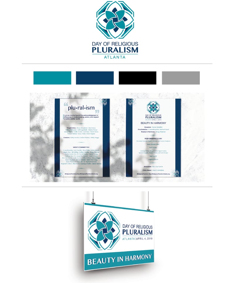
Civic project that represents global message symbolizing the values of the Aga Khan Institution, specifically, on the ethic of pluralism. Based on the history of religious culture, the elements were formed by the fusion of geometry and organic shapes to represent unity and simplicity.
"With a theme of Beauty in Harmony, Atlanta’s event was centered on art as a language that can cross all barriers. Curated art exhibits as well as poetic and musical performances showcased faith-inspired beauty in harmony with diverse compatriots. It was a tangible representation of pluralism at its best: an intentional meeting of commitments rather than a surface-level assimilation of beliefs."

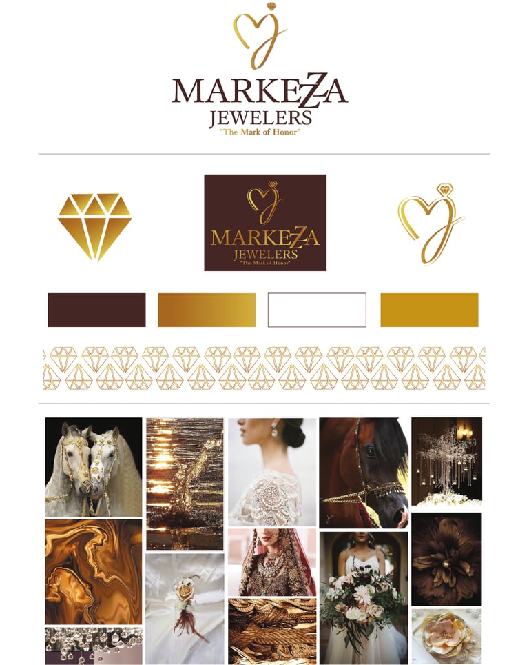
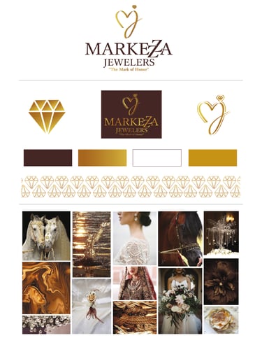
A complete rebrand designed to visually communicate the essence of the jewelry store—what they stand for and who they are. The objective was to convey elegance and sophistication through a refined aesthetic, using a palette of muted yet bold colors that reflect the brand’s meaning and values. As part of the rebrand, I developed a new logo, curated a cohesive color palette, designed custom icons and patterns, and reimagined the business cards to create a unified and luxurious brand identity.