
Day of Pluralism
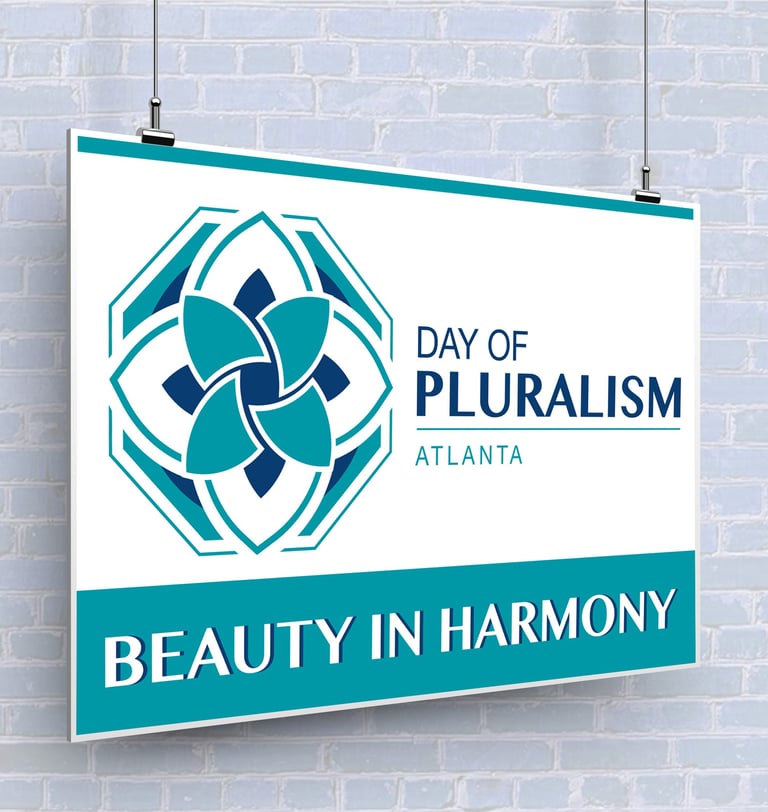
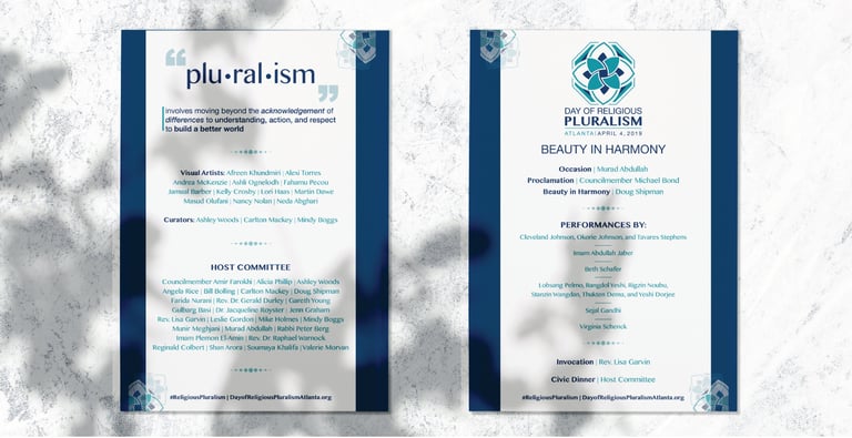
The visual identity was designed to embody stability, inclusivity, and interconnectedness. Geometric elements represent structure and foundation, while flowing organic shapes introduce movement, humanity, and collaboration.
The balanced linework and minimalist composition reinforce clarity, peace, and timelessness. The color palette was intentionally selected to evoke tranquility, strength, and cultural harmony — visually supporting the core message of pluralism and collective belonging.
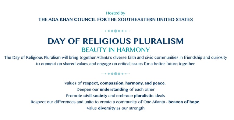
*Previously known as "Day of Religious Pluralism" but was updated.
Graphic Design
Brand Identity
Logo Design
Marketing